Artist Study:
Jenny Holzer is a conceptual artist from America. She is most commonly known for her work using text & written passages projected onto buildings & well known architecture & landmarks like London City Hall & The Rockefeller Center in New York. Another of her more known works her series on LUSTMORD, which takes a look at the perpetrator, victim & observer of a twisted sexual murder. One of the main parts of this series was of her writing the thoughts & actions of the three individuals onto human skin. Out of the many photos from this series, one in particular stands out to me:
 | |||
| "LUSTMORD" (1993-94) by Jenny Holzer |
I hook my chin over her shoulder. Now that she is still I can concentrate.
This is a thought of the perpetrator, & suggest to the audience that the victim has been raped, & the “now that she is still, I can concentrate” suggests that the victim has been killed by the perpetrator, & that he can kind of relax now that the victim is dead.
 | ||
| "LUSTMORD" (1993-94) by Jenny Holzer |
The colour of the writing was also significant in this series as they had different meanings, for example the red writing in the photo on the left signifying scars of the victim, whereas on the right, the writing is in blue & signifies the bruising made by the killer.
Another American Conceptual artist is Barbara Kruger, who's main focus in her work has been her black & white photographs captioned with a red border & white writing, usually in a Futura Bold Oblique or Helvetica Ultra Condensed font. Her captions are usually declarative, often voicing feminist & consumerism views.
 |
| "I Shop Therefore I Am" (1987) by Barbara Kruger |
The phrase "I Shop therefore I am" originally comes from Cogito ergo sum, a Latin philosophical phrase by René Descartes, in English meaning "I Think, therefore I am". The meaning of this phrase is simply someone questioning whether or not they exist, & therefore of one being able to think answers this question of that you exist if you can think.
Compared to Holzer & Kruger, Jim Goldberg takes an opposite approach to his photographs, rather than focusing on the main-stream news & population, he takes a more in-depth look into the lives of the more neglected population. One of his earlier books, Rich and Poor: Photographs, saw him take photographs of random people & households from both ends of the social scale & in which showed us the reality of America.


 |
| "Rich & Poor: Photographs" (1985) by Jim Goldberg |
By getting them to write on the photographs he had took of these people, they gave their stories & statements on what they were like, how they lived etc.
Alison Jackson is a British Contemporary artist, most known for her photographs of celebrity look-a-likes. Her most famous celebrity look-a-like photos are probably those of the late Princess Diana taken in black & white film in 1999, a couple of years after her death. This did not start with her taking photographs of the look-a-likes, but first by getting a photo of Diana & shooting at it with a gun. From this she went on to shoot probably the most iconic shot of this series, a studio photo of Princess Diana & Dodi Al-Fyad with their mixed race love child.
 |
| "Mental Images" (1999) by Alison Jackson |
From this she went on to take more look-a-like photographs of other celebrities such as the Royal Family, Tony Blair & George W. Bush among others. She did this because the population have a fixation with what is going on in the celebrity world & she wanted to put these well loved celebs into strange & shocking situations to see the public's reactions to them. Although her work does not have any text in the photos themselves, Jackson often finds herself displaying them with written work about how & why she took these photos, & once commented on the Diana photos that "I started making work about Diana as a national icon at the time of her death. Millions mourned her through her image. Most of them did not know her in person; they only "knew" her through photos, TV etc. I thought I would make images of her, using a lookalike, to explore our perception of her and our fantasies about her love life."
Gillian Wearing took a completely different approach to taking text & image photographs. Her series was entitled "Signs that say what you want them to say and not Signs that say what someone else wants you to say" is probably one of her most notable works of photography. In this she took to the streets to scout down members of the public & get them to write down a thought they had or just a simple statement about them & then take photos of them holding up that piece of paper. Some of the statements were interesting, especially for the people who wrote them down.
 |
| "Signs that say what you want them to say and not Signs that say what someone else wants you to say" (1992-93) by Gillian Wearing |
For example here we have a police office who has written down help onto the piece of paper he was given, leading us to wonder why he has written this down, whether its because the job is stressful or perhaps whether its because as a black officer he's the subject of racial abuse to the public (this being in the early 90's the problem of racism was still fairly regular).
Martin Firrell is described as a cultural activist & a campaigner, & much like Jenny Holzer, he has projected texts & passages onto buildings & architecture, in which he has questioned subjects such as politics, faith & cultural diversity. One of his most notable photo’s is of just one single word “Think” from his series "A Question Mark Inside", which was projected onto St. Paul’s Cathedral in London, he did this to attempt to answer a question "What makes life meaningful & purposeful?" by means of the public's response, his own thoughts & through interviews with academic sources.
 |
| "A Question Mark Inside: Think" (2008) by Martin Firrell |
Firrell doesn’t just use his projections onto buildings to express his views, he has also used newsprint, the internet & even cinema screens.
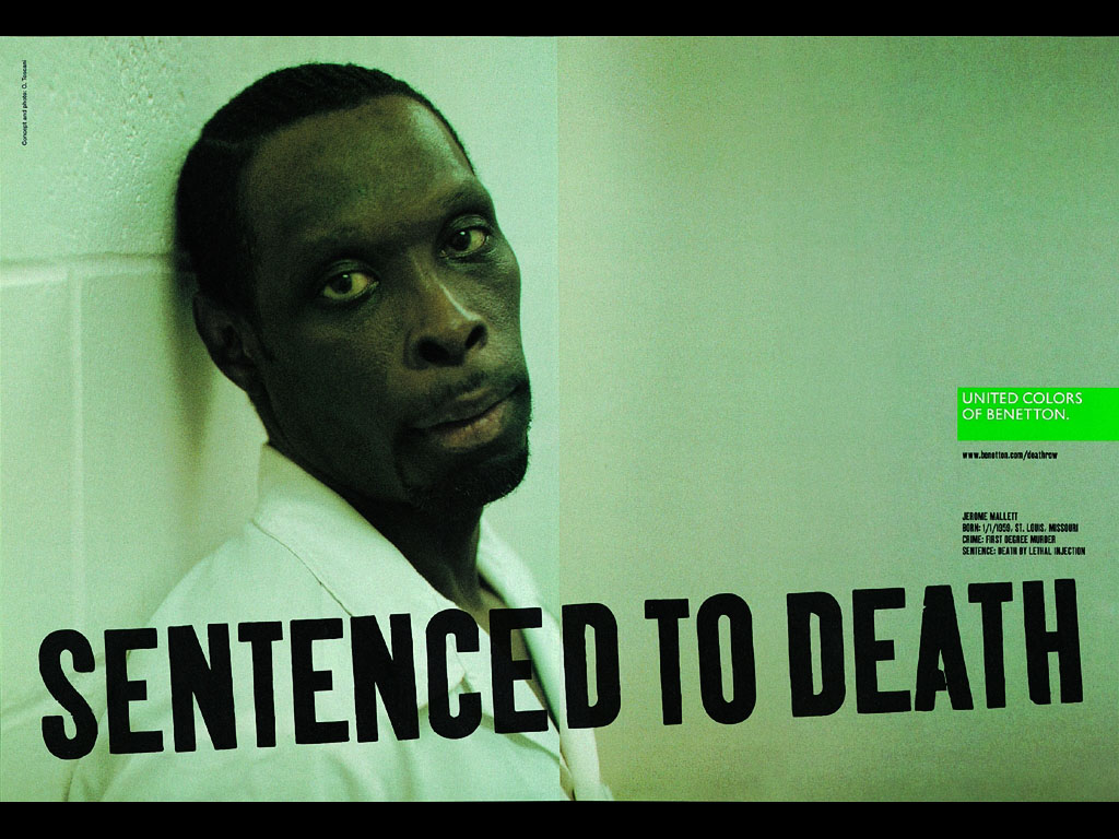
The Benetton Group have had different marketing ideas for there campaigns over the years for their Italian clothing company, one of the most striking was of inmates on death row from a variety of different prisons from America in 2000. The photographer for these photos was Oliviero Toscani, who had been the whole creative mind behind most of Benetton's market campaigns for some time & made them a household name across the world.
The images consisted of around 26 different inmates from six different states around America. They had "Sentence to Death" typed across the width of the photo, with the inmates name, birth date & place, crime & sentence on the side, along with the United Colours of Benetton logo.
Fashion will play a part in my shoot, as I plan to make it about stereotypes. Fashion photography comes in 2 different forms, the normal type is done with models, usually wearing the clothes for advertisement or just general fashion shoots, the other is still life fashion photography, where its just the clothes that are photographs. The earliest example of fashion photography was of Virginia Oldoini, Countess of Castiglione, in a book containing 288 photographs of her & was published by Adolphe Braun. This series of photographs made her the first ever fashion model in history.
At the beginning of the 20th Century, halftone printing became more advances, allowing fashion photography to be showed more in magazines, one of the first appearances being in french magazines such as La mode practique & as well as American magazine Vogue also having some major contribution to the development of publicising fashion photography.
----------------------------------------------------------------------------------------------------------------------------------------------------------
Initial Ideas:
One of my first ideas was going to be using a projector to project text over a model, with a variety of different words to describe someones character, but after researching the artists i had done before, the one i found was most inspiration to me was Gillian Wearing, who went around stopping different people in the public to write something down on a piece of paper & then photograph them holding it up. This lead me to think more into the certain subject that would be the image & text, which was stereotypes of the public.
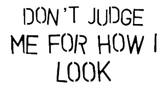
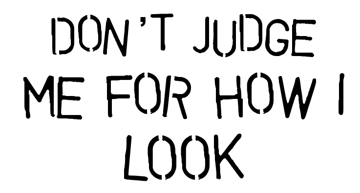
This changed main final idea & it was to have one model, a friend of mine, & have her dress up in her normal day casual punk like clothes, which were basically pinstripe jeans with chains on them, a black tank top & leather jacket, some bright green boots & some other accessories as well. Unlike Wearing, I would be typing onto paper stereotypical phrases for my model to hold up, so I did a bit more research into, but only found phrases that only skimmed the surface of what I really wanted for my photos, so I came up with 3 different phrases, all around the subject of the public judging certain stereotypes just for how they look:
"Don't Stereotype Me" "Don't Judge Me For How I Look" "Only I Can Judge Me For Who I Am"
Fonts:
The choice of font I wanted to used had to be a font that people were able to read, but I didn't want to use some ordinary default font such as Arial used on Microsoft Word etc, I wanted a unique font that stood out as well as readable. So I had a look on http://1001freefonts.com, which gave me a huge range fonts to choose from. My final list came up with these:

All of these fonts came from the army/stencil section on the website, & they were all very easy to read. My final decision was on the Vegetable font, with this font my phrases came out like this:
 Now,
the apostrophe doesn't come out on this font, so I had to improvise by
using a different font for the apostrophe, so the final texts came out
like this:
Now,
the apostrophe doesn't come out on this font, so I had to improvise by
using a different font for the apostrophe, so the final texts came out
like this:


-----------------------------------------------------------------------------------------------------------------------------------------------------------
 The
photo itself is good as well as the lighting, but it was just a bit
too dark for me as I wanted to get the features of her dark clothing
not merging into the background as much.
The
photo itself is good as well as the lighting, but it was just a bit
too dark for me as I wanted to get the features of her dark clothing
not merging into the background as much.
So my final setup looked a little like this:


The Benetton Group have had different marketing ideas for there campaigns over the years for their Italian clothing company, one of the most striking was of inmates on death row from a variety of different prisons from America in 2000. The photographer for these photos was Oliviero Toscani, who had been the whole creative mind behind most of Benetton's market campaigns for some time & made them a household name across the world.
 |
| "Death Row Campaign" (2000) by Oliviero Toscani for The United Colours of Benetton |
Fashion will play a part in my shoot, as I plan to make it about stereotypes. Fashion photography comes in 2 different forms, the normal type is done with models, usually wearing the clothes for advertisement or just general fashion shoots, the other is still life fashion photography, where its just the clothes that are photographs. The earliest example of fashion photography was of Virginia Oldoini, Countess of Castiglione, in a book containing 288 photographs of her & was published by Adolphe Braun. This series of photographs made her the first ever fashion model in history.
 |
| Virginia Oldoini, Countess of Castiglione |
----------------------------------------------------------------------------------------------------------------------------------------------------------
Initial Ideas:
One of my first ideas was going to be using a projector to project text over a model, with a variety of different words to describe someones character, but after researching the artists i had done before, the one i found was most inspiration to me was Gillian Wearing, who went around stopping different people in the public to write something down on a piece of paper & then photograph them holding it up. This lead me to think more into the certain subject that would be the image & text, which was stereotypes of the public.
This changed main final idea & it was to have one model, a friend of mine, & have her dress up in her normal day casual punk like clothes, which were basically pinstripe jeans with chains on them, a black tank top & leather jacket, some bright green boots & some other accessories as well. Unlike Wearing, I would be typing onto paper stereotypical phrases for my model to hold up, so I did a bit more research into, but only found phrases that only skimmed the surface of what I really wanted for my photos, so I came up with 3 different phrases, all around the subject of the public judging certain stereotypes just for how they look:
"Don't Stereotype Me" "Don't Judge Me For How I Look" "Only I Can Judge Me For Who I Am"
Fonts:
The choice of font I wanted to used had to be a font that people were able to read, but I didn't want to use some ordinary default font such as Arial used on Microsoft Word etc, I wanted a unique font that stood out as well as readable. So I had a look on http://1001freefonts.com, which gave me a huge range fonts to choose from. My final list came up with these:

All of these fonts came from the army/stencil section on the website, & they were all very easy to read. My final decision was on the Vegetable font, with this font my phrases came out like this:


-----------------------------------------------------------------------------------------------------------------------------------------------------------
Studio Setup:
In the studio I was going to be using a low key lighting setup, so all i needed were 2 mono heads with soft boxes attached. Initially, I only planned on using 1 mono head with a soft box, but after having a little playing around with some shots which came out like this:
In the studio I was going to be using a low key lighting setup, so all i needed were 2 mono heads with soft boxes attached. Initially, I only planned on using 1 mono head with a soft box, but after having a little playing around with some shots which came out like this:

So my final setup looked a little like this:

My
model would stand in-front of a black backdrop, facing the camera.
There would be two soft boxes on each corner of the end of the black
backdrop, with 2 black reflectors at opposite angles to them to absorb
some of the light reflected from them. This would hopefully make it so
that my model was visible with her clothes not merging into the
background & also making sure that the background was as black as
possible so not to see the creases in the backdrop. But even if creases
did end up showing in the photograph I could always edit them out in
Photoshop.
---------------------------------------------------------------------------------------------------------------------------------------------------------
Contact Sheet:
Out
of 95 images I took during my studio shoot, only 13 of them made the
cut for my contact sheet. They were a range of my model holding up the
signs that I had printed out for her, in several different accessories
& jackets, but still keeping the stereotypical punk look.
 |
| Final Contact Sheet. |
Evaluation of Contact Sheet:
Photo 1:
The
photo is all in focus, you can clearly see the clothes she is wearing
are stereotypical to the punk genre & you can also see the text
clearly. However, you can see a crease in the backdrop where it starts
to curve onto the floor & is slightly less black than wanted.
-
Photo 2:
The
clothes are not quite as in sight as before due to the fact she’s
laying down, however the backdrop is nice & black & the text is
clear & in full view.
-
Photo 3:
Again
the clothes are not quite visible, but slightly more so than before. My
favourite part of this photo is her facial expression, as it’s a blank,
yet annoyed kind of expression. The backdrop is fairly black & you
cannot see any real creases on there.
-
Photo 4:
This
is one of my favourite photos out of the whole series; she is well lit
by the soft box lighting so stands out from the backdrop. The backdrop
is slightly blacker in some areas other than others, but this could be
later edited in Photoshop. Like photo 3, I love her somewhat blank
expression.
-
Photo 5:
A
good shot, the backdrop is just right in terms of how it is lit, as
well as my model as we can see that her clothes are not merging in with
the backdrop. Her posing is good, however I slightly don’t like how her
hair looks, I wouldn’t say it looks out of control, but just little bit
too much movement in it.
-
Photo 6:
Another of my favourites, my favourite part being how much her green
boots stick out compared to her other dark clothing. The backdrop is
nice, a bit more blacker down the bottom, but it fits in with the photo
in my opinion. The text is nice & clear, as for her clothing style,
however the photo may have looked better if the paper with the text on
might have not be pulled like this & slightly creased looking.
-
Photo 7:
One
my favourite part of this photo is her bored expression toward the
camera, as if she’s bored of the way people treat her for how she looks.
The backdrop has a mixture of black tones, which again could be edited
out in Photoshop if needed. The text is clear in this image however the
paper is slightly folded so the text looks slightly curved.
-
Photo 8:
The
backdrop is a nice mixture of blacks in this from the lighting, you can
slightly make out my models shadow, but it gives a nice effect. The
clothes are all visible & in good detail. Her expression is a kind
of disgusted look, which is why she is looking away from the camera
& more towards the floor.
-
Photo 9:
Another
good shot, the backdrop is mostly black, except for in the middle,
where it’s a little bit less black than the rest. The clothing again is
in good detail, & its clear what she’s stereotyped as. The text is
nice & clear to read
-
Photo 10:
The
image is clear with all the details of my model & the text is
highly visible. One of the best bits of this photo is her crouched down
pose onto the floor, however, you can see that she has written stuff
onto her hand, but it adds to the effect of being a stereotyped teen.
The backdrop is blacker in the bottom half of the photo & less black
in the top, something that can be edited with Photoshop at a later
date. One noticeable thing is that you can see where the paper with the
text on it has been creased.
-
Photo 11:
Possibly
my favourite image, I love her pose & the fact that you can see all
of her clothes in this one. Everything is in focus so you can see all
the detail in the clothing. The backdrop is the right amount of black in
it, which will not need editing much. The text can be seen clearly by
the viewer although the fact you can see the crease from where the paper
was folded is a little bit annoying, but other than that everything
else is fine.
-
Photo 12:
Another
fairly decent shot, like photo 11 you can see all of her clothes in
detail, her pinstripe trousers merge in a bit with the backdrop due to
the fact they are also black, but this isn’t much of a problem. Also
looking closely I can see a speck dust on the lens where the text is
shown, but this can be edited out. Her green hoody is nice as it stands
out from the backdrop, but doesn’t completely fit in with the punk
stereotype.
-
Photo 13:
This
is probably the only image that’s mainly focused on the upper body of
my model, so the only clothes you can really see in the hoody & tank
top, but only just the top of her trousers. The model stands out a lot
from the backdrop due to her turquoise hoody, which again doesn’t really
fit the whole punk theme. The text is clear to be seen, with only a few
creases in the paper & a few smudges of lipstick. Other than that
the photo itself is fine in detail & quality.
Final Decisions:
After evaluating my contact sheet I had a fairly clear view of what I would use as my final 4 photographs for this project.

I'd
so far narrowed it down to six photos, I was fairly sure on 3 of them I
could use for my finals, but slightly unsure for the last one. The
ones I was definite on using were 1, 2 & 6, but i was unsure on 3, 4
& 5 to use as the fourth photo. Out of my unsure photos, the one I
was most confident about was probably photo 3, as it was a full view
of my model & her outfit, the text was perfectly visible & in
general the photo was in good detail & quality.
----------------------------------------------------------------------------------------------------------------------------------------------------------
Final Prints:
After carefully looking at the 6 photos narrowed down, I finally made a decision about my final 4.
 |
| F/Stop: 18 - Exposure: 1/100 |
The
final decision came down to my models poses, the ones that were the
most interesting but had the text as visible as possible. I the end I
edited them by increasing the contrast of the image on Photoshop, I also
change the lighting slightly, so her skin is lighter & slightly
brighter as well as the paper, then finally I decreased the saturation
to -75.
 |
| F/Stop: 18 - Exposure: 1/80 |
Overall
this was a good project, I learned a lot about working in the studio,
what equipment is used & how to set up low key & high key
lighting shots, even if it took time & patience to get the the
lighting right for the photos when actually using the studio. It was a
really good experience being able to use the Canon EOS 5D DSLR for this
project, it gave me some really nice & detailed photos for this
project.
 |
| F/Stop: 18 - Exposure: 1/100 |
If
I were to ever redo this project I would probably try to use a bit more
of a variety of models from all types of stereotypical backgrounds, or
at least have 2
or 3 models that would have several different stereotypical clothing
types to change into & act like that stereotype. I would also
experiment a bit more, like trying use projectors to project images or
text onto the backdrop or model, & maybe even try a high key set up
for a shoot.
 |
| F/Stop: 18 - Exposure: 1/100 |
No comments:
Post a Comment